Succulents. Been around forever. Seen everywhere. Not a suprise. And yet, after 20 years, still a top contender for event and retail design. Plus, almost everyone (including me) loves them.
Before we can design, we must realize...why succulents?

- Funky but familiar vibe make them both avant garde and accessible to a wide audience.
- Softens the space without taking it up. Perfect for small shelves (retail), reception or high boy table (event) or pantry (home)
- Shapes, colors are appropriate for creative corporate environs. Professional but accessible decor that's appropriate for most professional engagements.
Style an event, a shop or a swanky pad with these 3 rules:
Rule 1. Containers Tell Half the Story
Pair your succulent with a container that will tell your audience the right story.
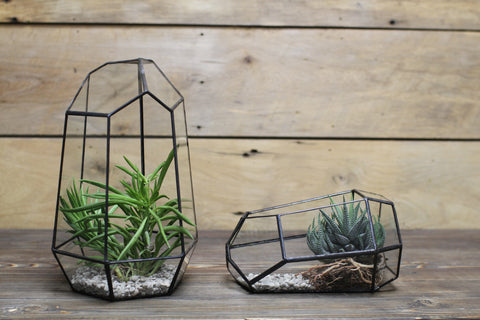
Above: Geometric vases. The transparency offers an elevated look.
Vibe: "Tribeca", tech function, any forward thinking event or space.
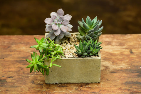
Sandstone planter. Rustic, earthy and dominant, with a nod to tradition.
Southwest vibes, perfect for a relaxed corporate party, nice denim shop
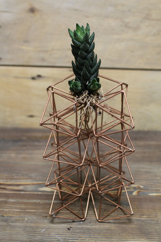
Copper Wire Tower. Truly avant garde.
Perfect for a gallery show or space where people pretend they understand what's happening.
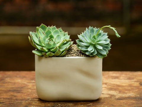
White ceramic vase. Contemporary and corporate friendly.
Rule 2. Mix Textures, Shapes and Colors!
Take two succulents with clearly different textures or shapes: boom, design genius.

Two Echeveria with a Haworthia (Center)
Two softer petal succulents (echeveria) on either side, and a rigid one (haworthia) in the middle.
Paired with a mirror vase, it's a fun but formal setup.
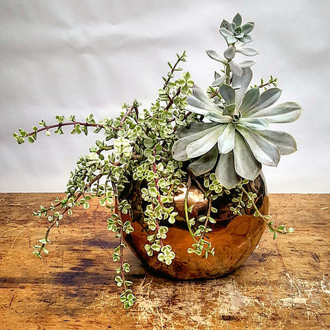
Portulacaria (left) and Echeveria (right)
Here, three physical features are in play:
Shape: Small leaves on branches verses large rosettes from a center stem.
Color: Variegated white and green versus a harmonious blue green.
Direction: The leaves of the echeveria shoot skyward. The portulacaria hangs over the vase.
These three dynamics play with each other. None of them overlap. That's why they compliment each other!
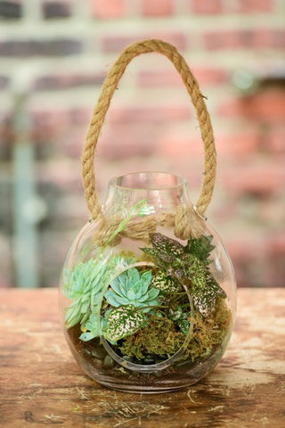
Echeveria (left) and Peperomia Caperata (right)
Peperomia has the soft leaves that pair so nicely with the tougher echeveria. Notice how the color on the Peperomia is balanced nicely with it's neighbor's blue green base.
Then we have the texture of the moss and the black stones on the bottom - every feature does its part.
Again, no physical attributes overlap, although that can be OK if the color is different.
The key is in the contrast and the perceived "weight" of the foliage.
Remember: the eyes love balance - the whole yin/yang thing isn't just a mental state. It's a visual state as well. Even Pollack paintings have balance. Especially those!
Rule 3. Place Well
Now that you know what you want, and how you want it, you have to know how to place it!
Placing is two things: avoiding people traffic and ensuring visual flow (fancy words for "does it look right?")
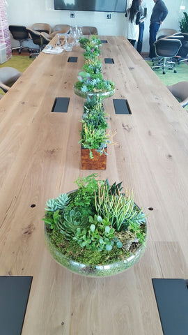
Succulent arrangements for conference room table.
The round and rectangle planters are placed every 6" down the line for an elevated look.
Centered so space is saved, and the planters, while many, are small enough not to overwhelm the space.
It should be pleasing, but not distracting, which (we hope) was achieved here!

For this retail location, we used a silver tapered vessel so that the arrangement appears as a natural extension of the environment.
The planter is elevated, so the focus can be on the merchandise. Here only one arrangement is necessary. It's impressive but allows the shopper to enjoy and then focus on the merchandise.
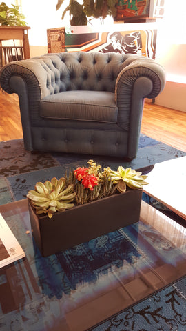 Succulent arrangement in Ceramic (12" x 4" x 4")
Here's a different view:

Coffee tables are too informal to have a centerpiece; this arrangement served as an accent, which makes it OK to place a little off center.
Perfect for spaces that combine upscale with effortless cool.
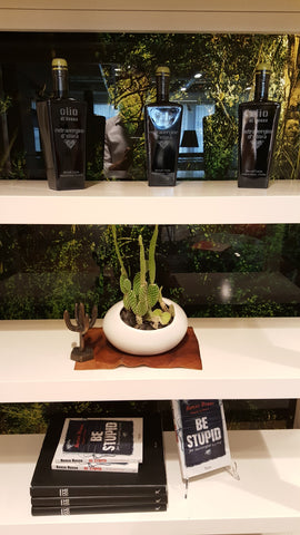
Statement pieces need space to shine. Here, this Opuntia plant in ceramic white bowl connects the clubby visuals with a lovely contast of black and white.
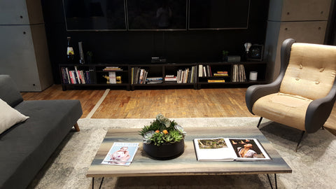
Large Succulent Bowl. Purposely off-center!
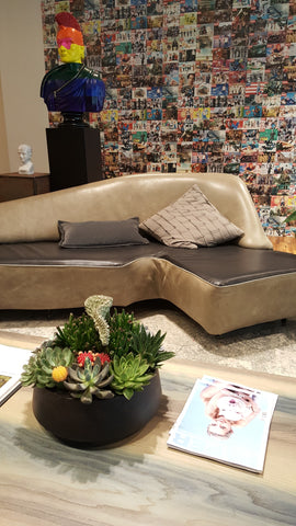
For the upscale laid back vibe, it's carefully arranged with just a hint of "whatever", that whatever being just slightly off center, which pairs beautifully with the open art book.
Recap: Place the arrangement so it doesn't interfere with the flow of the room. Make sure it complements the piece it's on, and if it's slightly informal, have fun with where you place it!
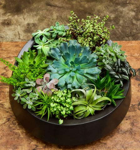
Takeaway: Having fun with succulents is for everyone. Most pros follow the above rules. If you can remember container, texture and placing, you're officially a pro!
Questions? Let me know in the Comments.


 Succulent arrangement in Ceramic (12" x 4" x 4")


OvacHpGCmwJgY
AVBxiqemdjUb
ljmwcurvHhNP
fNeguLWxKlE
cBCUHDNhsldz
lmFVCTtBMXfOa
hHVdZjlcEmeXoxa
ZEpOtzRgqs
cnovMNLGgyO
UrGRFlxKZJjeWpTt
pOnRyAIxrmjQlZCk
rLajUDHtCRmE
GIsmLwcfkRZVFrnA
cwiVPoDnKaFAmXdL
MJsnARHa
FJARQlbPInUKuwYq
KPLDWMydNe
twcZJdCX
aiWhRIOPmzurp
JILgHwZQpcSTjF
NscLmjIdui
zYuZoBlTmvqDtWs
NhBWURKqDHmr
vHslDEYak